Credit is when you use borrowed money with a promise to repay it at a later date. Credit comes in many forms from credit cards to mortgages. There is a wide range of ways to use credit, which means that it is often a challenge for beginners to learn all the ins and outs of using credit wisely.
Basic Credit Terms
Before diving in to how the pieces work together, you need to understand the basic terms that are used when speaking about credit.
Principle
Principal is the amount of money that you borrow. You are expected to re-pay the principal plus any interest charged.
Interest Rate
The interest rate is how much you are charged for the right to use borrowed money. The number is expressed as an annual interest rate.
Credit Limit
Your credit limit is the total amount you are allowed to borrow. This is set by the lender based on your ability to repay.
Grace Period
The grace period represents the time between when you borrow money and when interest begins to be charged on the principal.
Minimum Payment
The minimum payment is the smallest amount you can pay each month before your credit card company considers you defaulting on your debt. This minimum payment is based on a percentage of your total principal balance.
How Does Credit Work?
Credit works based on trust. You, as the borrower, ask a lender for a “line of credit” or the opportunity to borrow money for your own needs. In return, you promise to pay it back. If the lender agrees, the credit will be extended to you, based on certain terms and conditions. These terms are generally based on what you intend to buy, how likely you are to make all payments on time, how trustworthy you have proven yourself in the past with borrowed money, your income, the overall conditions of the market, and a few other factors.
At the end of the day, the more trustworthy you have proven yourself to creditors, the better terms you can get when borrowing money. Why? Because you are seen as a lower risk. However, if you have never borrowed money before or if you have borrowed money but were not very trustworthy about repaying your debt, you will get terms that aren’t as good.
What Are My Credit Terms?
The terms of your credit refers to how much money you can borrow and how expensive it will be for you. Receiving “good terms” generally means higher credit limits (meaning you’re allowed to borrow more money at one time), lower interest rates (making it less expensive to borrow), and other perks like cash back and flight miles. For beginners, focusing on lower interest rates should be your biggest concern when shopping around for credit cards or car loans.
How Can I Improve My Terms?
Since your credit terms are determined by trust, the best way to improve your terms are by using credit and reliably paying it back. This shows creditors that you are able to manage regular payments and will very likely be able to pay back your borrowed money on time.
From a creditor’s point of view, every time they lend money it is an investment. The return on their investment would be the interest rate you are charged to borrow money, and their risk is the likelihood you do not pay them back on time or you don’t pay at all. If your personal financial history has shown that you can reliably make your payments, they believe you’re a safer investment and you get offered better terms. And the more often you show that you’re responsible with borrowed money, the better those terms will be for subsequent offers.
Creditors use credit reports to share information with each other about who does and who does not pay their bills, so you won’t be able to get out of a bad credit history by switching to a different lender.
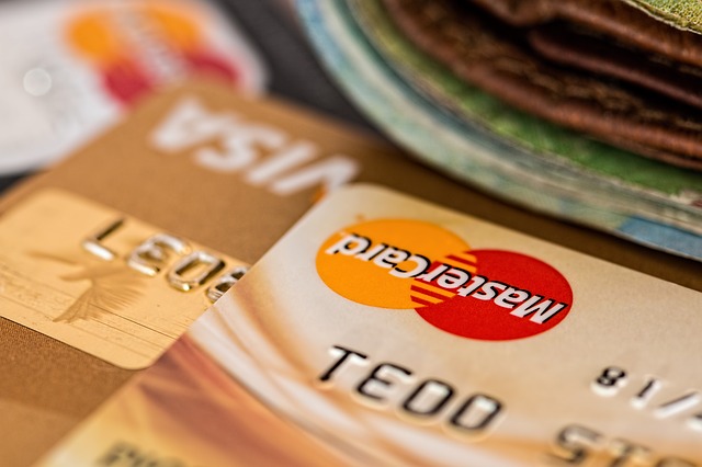
Credit In Practice – A Credit Card
Let’s imagine that a credit card company agreed to give you a credit card with a $300 credit limit. You decide to use that credit card to purchase a new TV for $300. Your principal balance is now $300, and since you maxed out your credit card with that one purchase (you used every dollar they would let you borrow on that card), you cannot use your credit card for more purchases until you pay down what you now owe.
The credit card company now gives you a grace period before the first bill comes due. The grace period is the time between when you make the purchase and when you get charged interest. The grace period is usually 3-4 weeks, but this can vary a lot depending on your credit card company.
After the grace period ends, the credit card company will start charging you interest on your purchase. The amount of interest you pay is based on the interest rate you were offered in your terms and the amount of principal you owe. Once the interest charge is calculated, it is added to your principal balance to determine how much you owe now. The interest is the extra money you pay for the privilege of borrowing money
You will need to make at least your minimum payment every month in order to remain in good standing with the credit card company. The minimum payment is either a flat amount (e.g. $25) or a percentage of the principal balance you owe plus interest charges and late fees. If you consistently pay less than the minimum payment, you will never fully pay off your debt. And if you only pay the minimum payment, you will be stuck paying off relatively small credit card debts for many years. In the end, this means you could be paying more for the interest you were charged than for the original item you purchased. The best tip is that you can always pay more than the minimum payment. As you make payments to reduce your principal balance, you can start using your credit card again. In our TV example, if you paid off $100 of what you borrowed on your credit card, you can now use the card to make additional purchases. Just remember that your limit is $300. Once your principal balance is zero, you’ve paid off your credit card and no more interest will be charged. Then you can consider making another purchase.
Credit In Practice – A Mortgage

If you need to buy a house or property, you will most likely need to take out a mortgage. The biggest difference between a mortgage and a credit card is that with a mortgage, you are borrowing the money for a very specific purpose, usually to buy a house. The house you are buying then becomes collateral in the loan, meaning that if you fail to pay back the loan, the creditor can take your house.
Because the mortgage is backed by collateral, the creditor is taking on less risk in lending you the money. And because you are in a less risky situation, the lender will usually offer you a much higher credit limit and better interest rates than you would receive for a credit card, even with the same credit score and credit history. Other than a higher credit limit and a lower interest rate, mortgages work in the same way that credit cards do. You will still have minimum monthly payments to make and you will get charged interest every month on the balance you owe. Unlike credit cards, there are two types of interest rates used with mortgages, fixed and adjustable.
Fixed-Rate Mortgages
A fixed-rate mortgage is just how it sounds—the interest rate is fixed for the entire duration of the mortgage. This means your rates and payments will be predictable for the life of the loan. As a trade-off, the interest rate on fixed-rate mortgages may be slightly higher, on average, than for adjustable-rate mortgages.
Adjustable-Rate Mortgages
With an adjustable-rate mortgage, your interest rate can adjust and change over the term of your mortgage based on the overall market interest rates. Lenders prefer these types of loans because it means they can increase or decrease how much they’re charging the borrower based on prevailing market rates.
As a borrower, when you get an adjustable-rate mortgage, you lose some predictability in your monthly payments. Normally you are offered an interest rate for the first 5 years of the loan which is lower than the rate you could get for a fixed-rate mortgage. But after those initial 5 years, the lender can change the interest rate every year.
What Else Impacts My Credit?
There are a lot of other factors besides your credit history that will impact your credit and payments. The biggest of these can be the extra fees that credit card companies charge for using certain services. These can be tricky and add up fast.
Fees vary widely, both in type and amount depending on the credit card company, so reviewing potential fees should definitely be on your list of things to check when comparison shopping for credit cards.
Other factors that impact your credit terms include your income and the general market. If you earn more money, you will likely have higher credit limits and lower interest rates, since creditors see that you have a greater ability to pay. If interest rates in the overall market are low or high, this will also play a significant role in the rate you are offered.
When it comes to the amount of interest you are charged on your outstanding balance, another factor could be how your interest is calculated. Some creditors calculate interest monthly while others calculate daily. This calculation should impact how you pay your bill. If interest is calculated monthly, you benefit by making a big payment once per month right before the interest is calculated. If interest is calculated daily, you benefit most by making many smaller payments throughout the month.
Pop Quiz!
[qsm quiz=70]
Challenge Questions
- In your own words, , explain what credit is.
- How can credit help you with managing your money?
- What is a credit score?
- How can credit hurt you financially?
- How can scammers and fraud effect your credit score?
- Why do people take out mortgages for such a long period of time?


 Each person starts off as an Unskilled Worker, meaning they do not have any specific training or professional skill sets that set them apart from any other worker. If a person goes to school or gains enough experience to become a Specialist or Expert, they become a Skilled Worker (


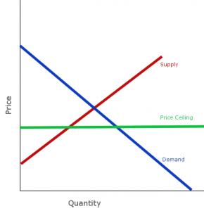 Price Ceilings are controls put in place to prevent the price of some good or service from getting too high. This type of control is most common with food, where there might be a maximum price that businesses can charge for things like flour or electricity.
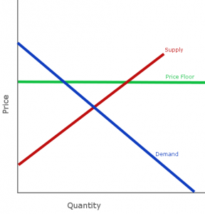 Price Floors are the opposite – a control put in place to ensure that a certain amount of something is produced by making sure producers are guaranteed at least a certain price for what they supply. These types of control are common for milk.
 Interest rates are growth rates – it is a percentage that is used to calculate how much a loan or investment grows over time.
 If a loan is risky, the lender will charge a higher interest rate to compensate for the fact that they might not get paid back at all. On the other hand, very reliable borrowers usually have much lower interest rates.
 You can use more of your income for consumption and less for saving, but this might mean that you will have less consumption later when you lose your job or retire. You can save and invest more of your income, but that means you will have less available to consume today.

 Imagine there is a company that builds cars. At first, there are just four employees – Alice, Bob, Carol, and Dan. They are building each vehicle by hand, and all work together in each part of production. In this case, each person is switching their tasks quite often, and so becomes proficient at nearly all aspects of the business. These tasks include:
 Imagine you want to buy some stock for your virtual portfolio – you can afford one share of either Apple (
 For example, it is currently possible for the governments in most cities in the United States to completely eliminate homelessness if they applied 100% of their city budget towards building new homes for the poor. The cost of this would be every other program, from water treatment, to police forces and fire departments, and schools.
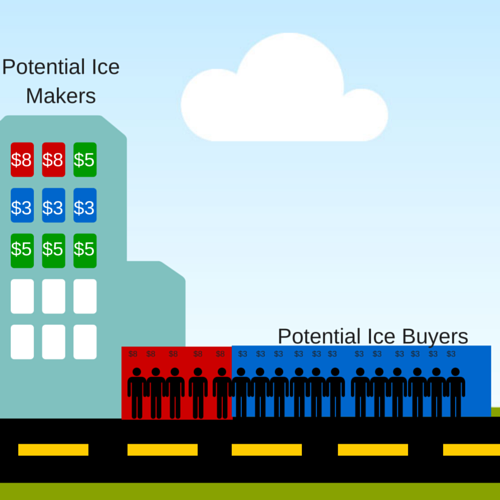
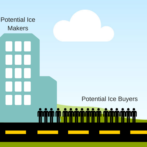 Immediately, one person makes and sells 100 ice cubes for $10, with no cost other than time. Because of Supply and Demand, very few of the consumers are willing to buy at this price (see our article on
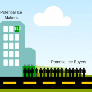


 Starting and running a small business is not for everyone, partly because there is a huge amount of risk involved, and partly because it takes a huge commitment of time and resources.

 Many colleges and universities also offer special course part-time courses to help teach new and potential entrepreneurs basic business skills, like basic accounting and management.


 In come cases, the direct producers and consumers are not the only ones who are impacted by a good being produced or consumed. Pollution is a good example – if a company dumps toxic waste in a local river as part of its production process, the price of cleaning it up is not reflected in their production cost.


 Generally speaking, options are used in many areas of business and investment. Employees of larger companies frequently get stock options as an incentive to stay with the company for a long time and help the company increase in value. A lot of real estate transactions involve the option to purchase additional neighboring acreage at a certain price within a certain number of years. And even leasing a car usually contains a “purchase option” at the end of the lease term.